Introduction
Hello! My name is Anthony Trujillo and I am a 3D environment artist from Los Angeles, CA. I graduated from the Art Institute in Santa Monica in 2009. My passion for 3D art began in college and I have loved creating props and worlds ever since. One of my first jobs was at WayForward Technologies and I helped work on DuckTales: Remastered, which was awesome, as the original was very special to me. I’m currently at WhiteMoon Dreams where we just released StarBlood Arena on PSVR.
Pre-production
My main goal with the ArtStation Civilizations: Lost and Found challenge was to actually finish. I didn’t want be overly ambitious and not finish on time, so I focused on finding a relatively small scene that I knew I could finish with the polish that it needed. I decided on this awesome concept by Lena Doronina.
Overwatch and Heroes of the Storm were my main inspirations going into this challenge. I would always be referencing the Blizzard style throughout the process.
Blockout
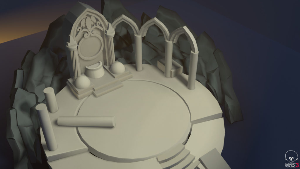
For my blockouts, I like to get my models in engine as soon as possible so I can start setting up basic lighting and find some nice camera angles. This helps me visualize the scene better and I can start adjusting scale and proportions. As you can see, my initial scale of my scene was off. The shrine prop was too small on the platform.
Modeling and Sculpting
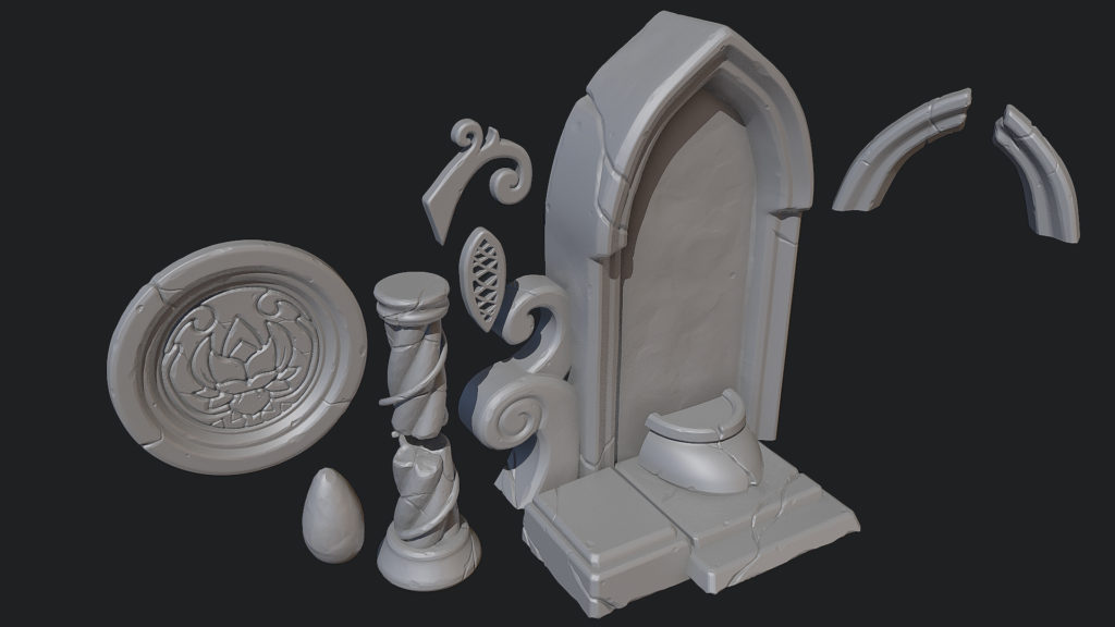
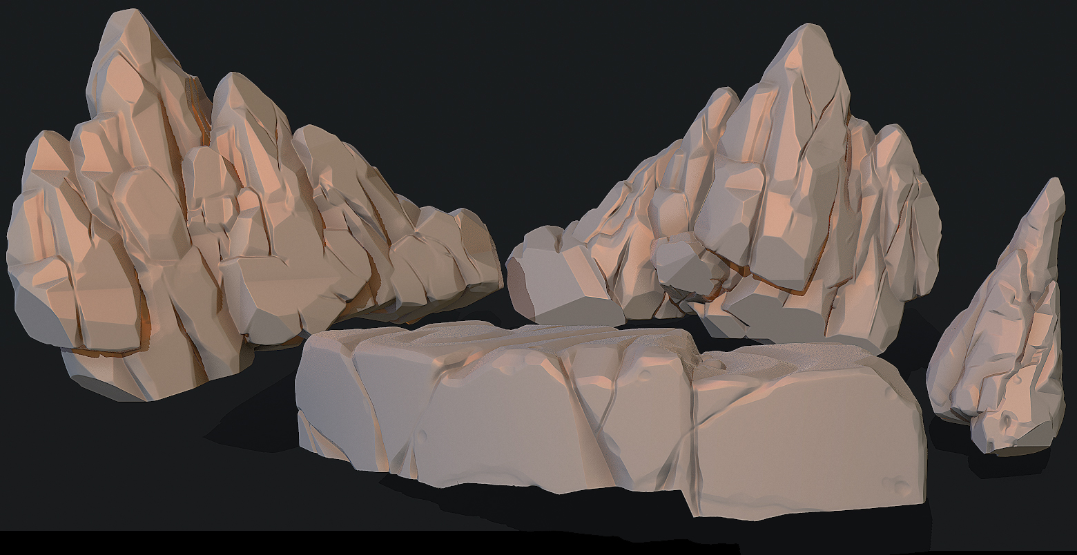
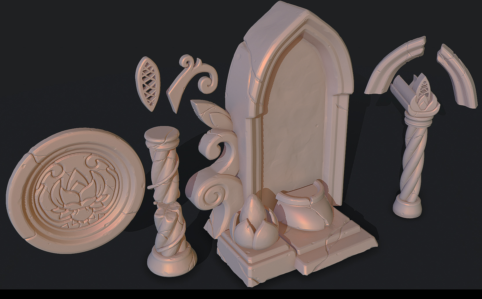
My main goal with modeling was to keep everything chunky and to try to avoid any straight lines. This meant tapering everything I could. I do a lot of the modeling in 3ds Max. Once the models are ready to Zbrush, I use the “double turbosmooth” method or Sub-D it to get a really clean, smooth model to sculpt on. Once in ZBrush, I apply an inflate 1 to the whole model, then a polish from the Deformation tab. I learned this from Michael “Orb” Vicente’s talk at a ZBrush summit–it helps smooth any sharp edges and keeps things chunky. From there, I use Trim Dynamic, Orb_Cracks, a slash brush, and clay tubes to add detail.
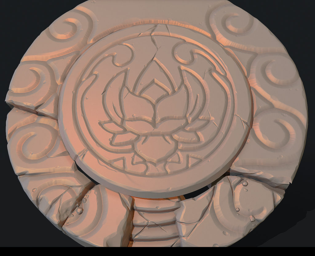
For the floor and the front plate, where it has an intricate flower pattern, I use another one of Orb’s techniques found here. I created the 2D design in Photoshop and convert it into an alpha to use in ZBrush. This method usually works really well.
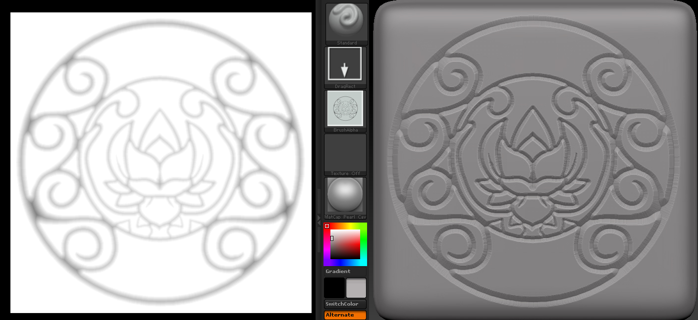
The biggest challenge for me was trying to keep everything chunky and to really push the silhouettes.

Grass
The grass is fairly simple. I am not using any normal map for it. I start by painting two grass clumps in black and white, then add a gradient map adjustment layer to get my colors. In the alpha, I have the grass fade to transparent as it meets the floor to make the transition not so harsh.
Texturing
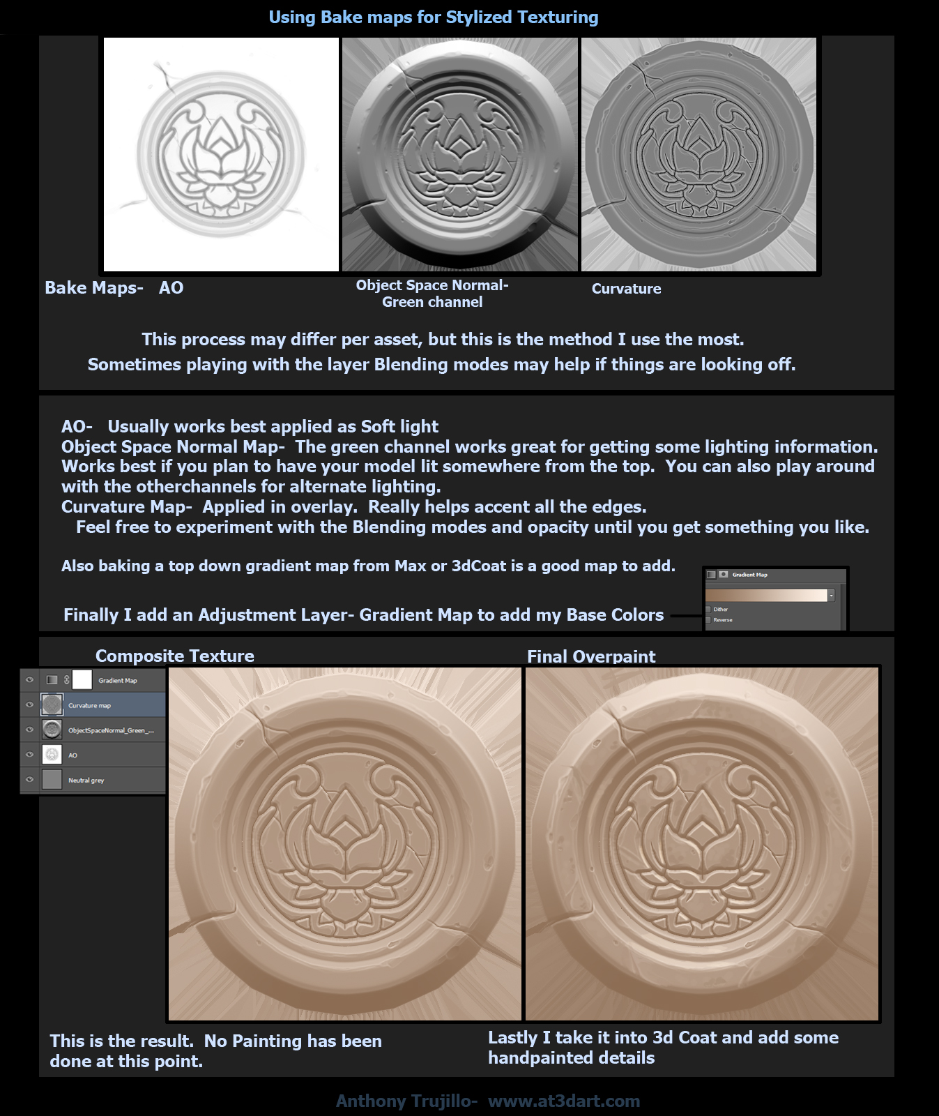
My texturing method for stylized work is very heavily influenced by Fanny Vergne‘s technique, which I first saw a couple of years ago in Vertex Magazine. I rely on my bake maps to get a really good base that I can then take into 3d coat and polish off. I use Knald or Marmoset 3 as my choice in Baker, and bake a Object space normal, Curvature, and AO. Sometimes I use a Heightmap depending on how much depth my sculpt has. Here is an example of my workflow. A lot of it comes down to playing with blending modes and opacity per asset.
Marmoset Toolbag
I have been a really big fan of Toolbag since it first came out; I love how user-friendly it is. When I saw Toolbag 3 had added Fog and Global Illumination, I wanted to use this challenge to test them out. One of my favorite features of Toolbag is being able to load in PSDs that auto update when I make changes. This makes for really quick experimenting and iterations.
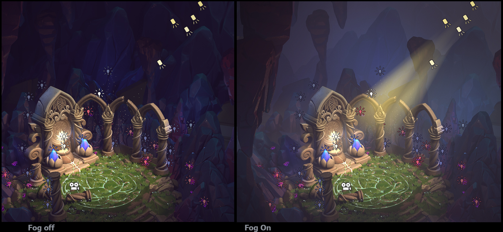
For the lighting, I picked a random sky and set it to a really low brightness, just so everything wasn’t pitch black. I started adding spot and fill lights. I knew I wanted to have the god rays coming through the ceiling, but when I started the project I wasn’t sure how I would achieve them in Toolbag. My first thought was to have planes with alpha to fake the god rays. But after adding fog to the scene, I found it kind of just turned my spot lights into god rays, as well as adding some great atmosphere. This worked great for the camera angles I was using. The only problem I had with this method was when all the lights started overlapping in certain views. The result was an extremely blown-out light source. Another problem I had was that you could see the rays were cone-shaped. I solved this by duplicating the spotlights and staggering them further upward from the beam to force it to stay thicker.
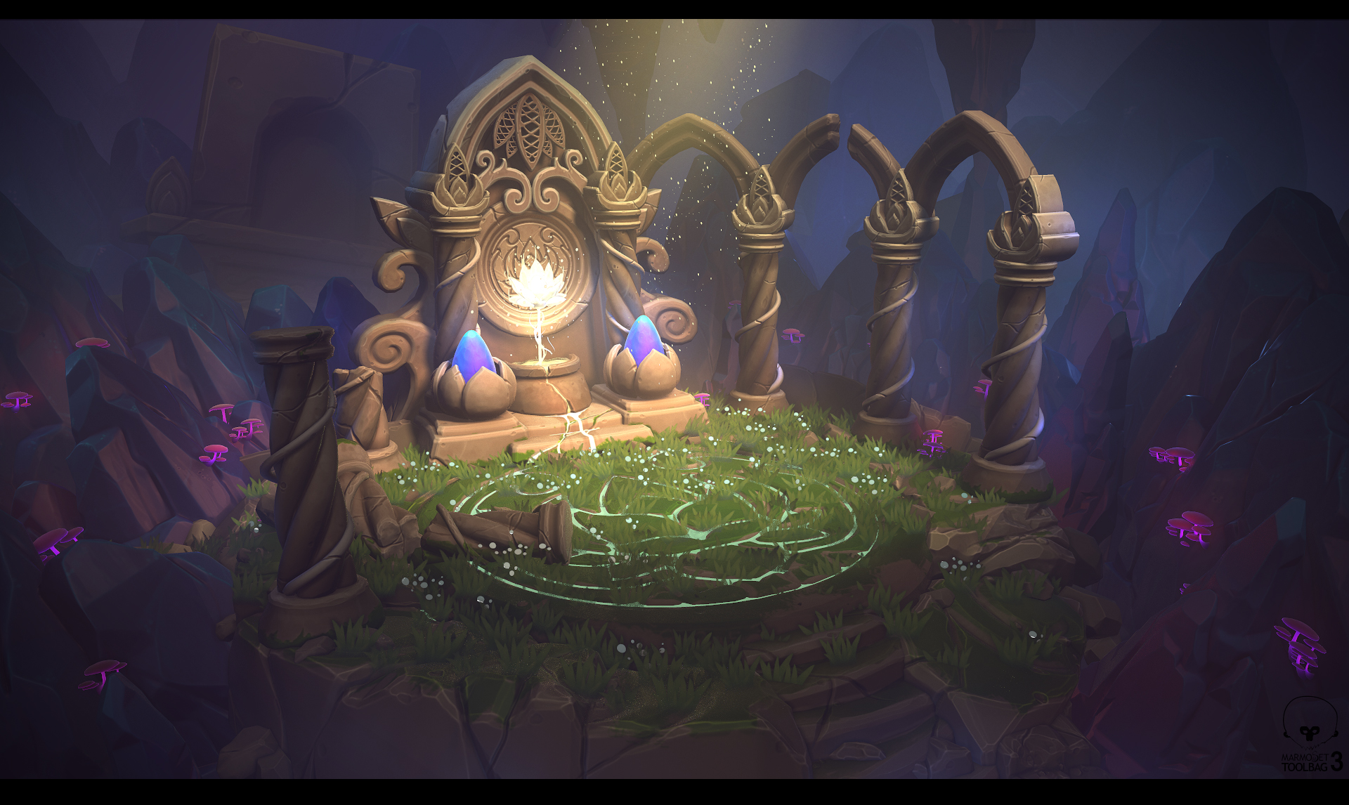
Overall, I am really happy with this project. I wanted to create a beautiful scene with great shapes while keeping it simple. I tried to remember to always be checking my silhouettes, not overdoing the textures, and keep everything chunky.
Thanks!
Anthony Trujillo, 3d Environment Artist at WhiteMoon Dreams.
Interview conducted by Kirill Tokarev for 80.lv.


